使用 CSS 显示元素的四个角边框

Published on:
Tags: css

为元素加上边框很简单,但是要单独给每个角加上边框就有点难了,下面介绍下实现该效果的两种方法,以及这两种方法优缺点的总结。

伪元素边框法

在看 CSS 代码之前,让我们先看看 html 的结构。

1
2
3
<div class="outter">
<div class="content"></div>
</div>

这里使用了内外 2 层 div,因为单独使用 1 个 div 来实现 4 个角边框不好实现,所以要用 2 个 div,每个 div 实现 2 个角边框的效果。

咱们再来看看 CSS 代码。

1
2
3
4
5
6
7
8
9
10
11
12
13
14
15
16
17
18
19
20
21
22
23
24
25
26
27
28
29
30
31
32
33
34
35
36
37
38
39
40
41
42
43
44
45
46
47
48
49
50
51
52
53
54
.outter {
position: relative;
padding: 5px;
}

// 外层右上有左下 2 个角
.outter::before,
.outter::after {
position: absolute;
content: '';
height: 10px;
width: 10px;
}

.outter::before {
right: 0;
top: 0;
border-right: 1px solid black;
border-top: 1px solid black;
}

.outter::after {
left: 0;
bottom: 0;
border-left: 1px solid black;
border-bottom: 1px solid black;
}

// 内层左上和右下 2 个角
.content {
position: relative;
}

.content::before,
.content::after {
position: absolute;
content: '';
height: 10px;
width: 10px;
}

.content::before {
left: -5px;
top: -5px;
border-left: 1px solid black;
border-top: 1px solid black;
}

.content::after {
right: -5px;
bottom: -5px;
border-right: 1px solid black;
border-bottom: 1px solid black;
}

这里主要使用了伪元素来实现角边框,我们知道::before::after 这 2 个伪元素可以添加显示内容,所以我们就用::before来实现其中一个角边框,::after实现另外一个。

但每个元素的::before::after只能出现一次,所以我们需要 2 个 div 来分别实现 4 个角边框的效果。

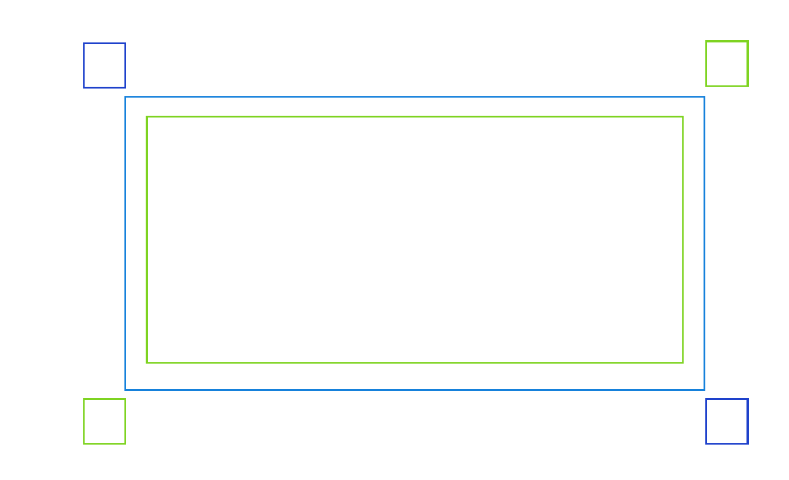
在实现每个角边框的时候,我们可以通过绝对定位的方式来设置每个角边框的位置,比如外层 div outter::before伪元素,我们设置其位置为top: 0; right: 0;,它的位置就是右上角。

这里要注意的是,如果内层和外层 div 不是完全重叠的话,内层伪元素的位置就要有所偏移,比如内层 div content::before伪元素,我们设置其位置为top: -5px; left: -5px;,这是因为外层和内层 div 因为padding而偏移了5px的位置,所以这里的绝对定位就不是top: 0; left: 0;了。
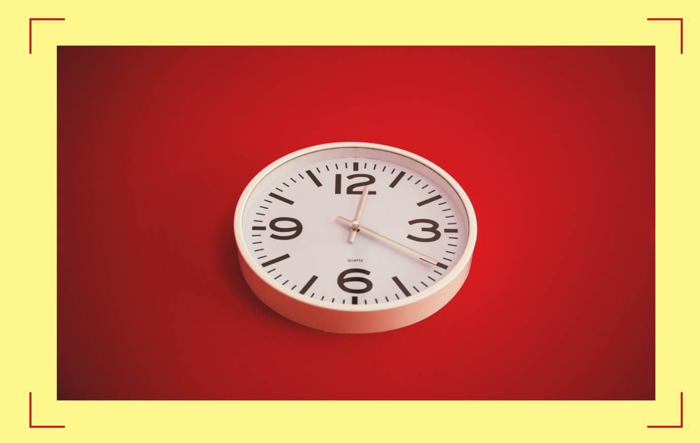
效果图

优缺点

  • 优点:灵活性高。
  • 缺点:CSS 代码比较多,html 结构也比较复杂,需要 2 个 div 来实现。

伪元素遮盖法

我们接着来看第二种方法,还是来先看下 html 的结构,这种方法的 html 结构相对比较简单。

1
2
3
<div class="content">
<img src="your/image/path" />
</div>

这里的img是我们要用角边框包括起来的内容,所以实际上我们只用到了 1 层 div。

1
2
3
4
5
6
7
8
9
10
11
12
13
14
15
16
17
18
19
20
21
22
23
24
25
26
27
28
29
30
31
32
33
34
35
36
37
38
39
40
41
.content {
border: 2px solid #ca1c1e;
display: inline-block;
margin: 25px auto;
padding: 25px;
position: relative;
width: auto;
}

.content img {
position: relative;
display: block;
margin: 0;
padding: 0;
z-index: 5;
}

.content::before,
.content::after {
content: '';
position: absolute;
background: #fff78e;
}

.content::before {
width: calc(100% + 50px + 4px - 120px);
height: calc(100% + 4px);
top: -2px;
left: 50%;
transform: translateX(-50%);
z-index: 1;
}

.content::after {
height: calc(100% + 50px + 4px - 120px);
width: calc(100% + 4px);
left: -2px;
top: 50%;
transform: translateY(-50%);
z-index: 1;
}

这种方法同样是利用了伪元素,但不是用伪元素来实现边框,而是用来遮盖边框。

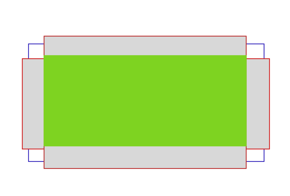
我们看到最外层的div设置了一个边框border: 2px solid #ca1c1e,这个就是我们最终会看到的角边框的边框,但是其中一些部分会被遮盖掉。

::before伪元素的代码来讲解:

1
2
3
4
5
6
7
8
.content::before {
width: calc(100% + 50px + 4px - 120px);
height: calc(100% + 4px);
top: -2px;
left: 50%;
transform: translateX(-50%);
z-index: 1;
}

使用伪元素::before遮盖掉了上下两边框的中间部分,可以看到其宽度设置为width: calc(100% + 50px + 4px - 120px),我们来解读一下这些数字的含义。

  • 50px是左右padding的宽度
  • 4pxborder的宽度
  • 120px是最后我们想显示的角边框的总宽度,首先它必须大于50px + 4px,不然会把边框完全挡掉,这里设置成120px,那么相当于角边框的宽度就是120 - 50 - 4 = 66,所以每个角边框的宽度就是33px

height: calc(100% + 4px): 高度就是总高度再加上border的宽度。

top: -2px: 从边框的上面开始定位,是为了把上边的边框挡住。

left: 50%;transform: translateX(-50%);: 水平居中。

z-index: 1;: 让伪元素可以挡住外层的 div。

::after伪元素原理和::before大致相同,只是把水平和垂直方向调换一下。

效果图

优缺点

  • 优点:一层 div 就可以搞定,结构相对简单。
  • 缺点:如果背景色需要透明的话则不适用。

总结

这就是实现元素角边框的两种方法,其实还有一种方法,就是使用 CSS 的clip-path来实现,但代码相对比较hard code,而且这个特性还是实验性的,所以具体怎么实现这里就不介绍了,感兴趣的同学可以看下这个 code pen

如果还有其他更好的实现方法欢迎留言,大家一起学习进步,谢谢!

赞赏

Comments